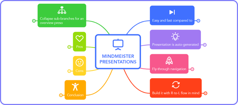
I recently took a deep dive into MindMeister’s presentation mode, which offers some intriguing functionality. Here’s what I learned.
Years ago, when mind mapping software first offered a presentation mode, developers enabled users to “zoom” or “fly” through their maps, one topic at a time. I loved this approach because it enabled anyone viewing your presentation to see how the current topic was related to those around it.
Gradually, most developers replaced that with a “snapshot” approach, which enabled users to create a series of screenshots of individual or groups of topics, which it then presented as a slide show – sort of like a PowerPoint presentation. I never liked this approach, because it was hard to see topics in context – how the topics on screen were related to those that came before and after.
When I discovered that MindMeister’s recently-updated map editor uses the “old school” approach, I was immediately intrigued. So I investigated it to learn more about it.
What I discovered is that there’s much to like about it, but also a few shortcomings. The video below summarizes my findings.
Do I recommend it?
Watch the 5-minute video below to find out!
The post A closer look at MindMeister’s presentation mode appeared first on Mind Mapping Software Blog.